
In a new take on the hand wrench, designer Paul Julius Martus developed this cool (and maybe a little bit creepy) cast bronze sculpture a couple years ago. It was picked up by places such as Boing Boing, Geekologie, and Core 77.

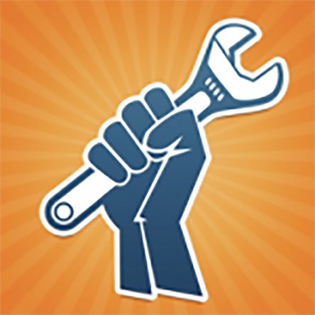
The sculpture reminded me of our hand and wrench logo, which is based off the “raised fist” symbol of resistance and unity. For us, the logo means solidarity, empowerment, and dedication to repair.
If your hand looks like the sculpture above, however, you might be taking dedication to repair a little bit too far. Your skin isn’t actually supposed to grow into your wrench (you should be putting it down to eat and sleep and stuff).


8 Comments
why would you use a symbol that is politically charged with stuff that has nothing to do with repair and ownership?
wittyahole - - Reply
Exactly. There’s folks on both sides of the political spectrum, and to have a fist logo like this can really be a turn off to the folks that despise what it represents in this day and age.
Chris -
Why do you think they are using a socioeconomically charged symbol? Almost like fixing things is inherently antica... I'll let you think for yourself :)
3_Pancakes -
I don’t understand. Do you support communism, Marxism, and all of the violence and oppression that comes along with it? That fist has flown recently while cities burned. Is that what you are supporting because I’m not sure what communist revolution has to do with fixing my console. I was very surprised to see this when I received my kit and it was all over the packaging. Kinda wish I knew that before I ordered.
Randy - Reply
I agree. The logo was on the tape holding my box closed. I was not very happy about that. I get the idea behind it with the right to repair being a revolution or movement, but in today’s day and age, probably not the best idea for a business logo. You just can’t escape the political divide these days.
Chris -